Ishaan Ahmed
Data Analyst
About Me
I Excel at pivoting more than just tables—turning data into strategy.
With a keen eye for patterns and process efficiency, I streamline workflows and optimise reporting.
Passionate about turning complexity into clarity, I make data work for businesses.
Skills
Excel | Power BI | SQL | Tableau
Data Analytics
Data Visualisation
Client Relationship Management (CRM)
Risk Assessment
Featured Projects
Professional Certifications

Google Data Analytics Professional

MS 365 Specialist: Excel Expert

IBM Data Analyst Professional
EXCEL | Parking Revenue Dashboard
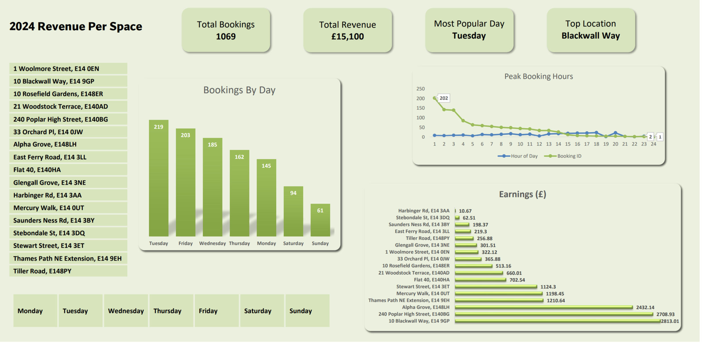
In 2022, I started my Data Analysis journey through starting my own Parking Business; Renting out parking spaces to provide affordable parking for residents. This Project looks at the performance of each space, over the course of each year and how the prices can be optimised to maximise revenue.❓ Questions I Was Interested in Answering:
1) What are the peak booking times and seasons for my parking spaces?
2) Which locations generate the highest revenue?
3) How does pricing impact booking rates?
4) What is the average duration of a booking, and does it vary by location?
5) Are there any trends or patterns in cancellations and no-shows?🔍 Steps I Took to Create My Analysis:
1) Data Collection & Cleaning
- Extracted raw booking data from 3rd Party Rental Site.
- Removed duplicates, inconsistencies, and missing values.2) Data Structuring & Preparation
- Used PivotTables and Power Query to organise booking records.
- Categorised data by location, date, revenue, duration, and booking status.3) Data Analysis & Insights Generation
- Created visualisations to track revenue trends and booking patterns.
- Applied conditional formatting to highlight peak and low-demand periods.4) Dashboard Creation & Automation
- Designed an Excel dashboard with key performance indicators (KPIs).
- Automated calculations to update revenue and occupancy metrics.📌 Key Takeaways from the Analysis:
✅ Peak Demand Periods: The highest number of bookings occurred during weekday mornings and weekends, indicating a mix of commuters and leisure travellers.✅ Top-Performing Locations: Spaces in high-traffic commercial areas consistently generated the most revenue.✅ Pricing Impact: Lower prices attracted more bookings but did not always increase total revenue - highlighting the need for dynamic pricing strategies.✅ Booking Duration Trends: Short-term bookings (under 4 hours) were least common, but long-term bookings (full-day or overnight) contributed significantly to revenue.✅ Cancellations & No-Shows: Higher in certain locations, suggesting that better cancellation policies or deposit requirements could be beneficial.📈 How This Dashboard Helps My Business:
This annual dashboard provides a data-driven approach to managing my parking business efficiently. By tracking seasonal trends, high-performing locations, and customer behaviours, I can adjust pricing strategies, optimise space availability, and maximise revenue. The dashboard also reduces manual effort by automating key calculations, ensuring I make informed business decisions faster.
Power BI
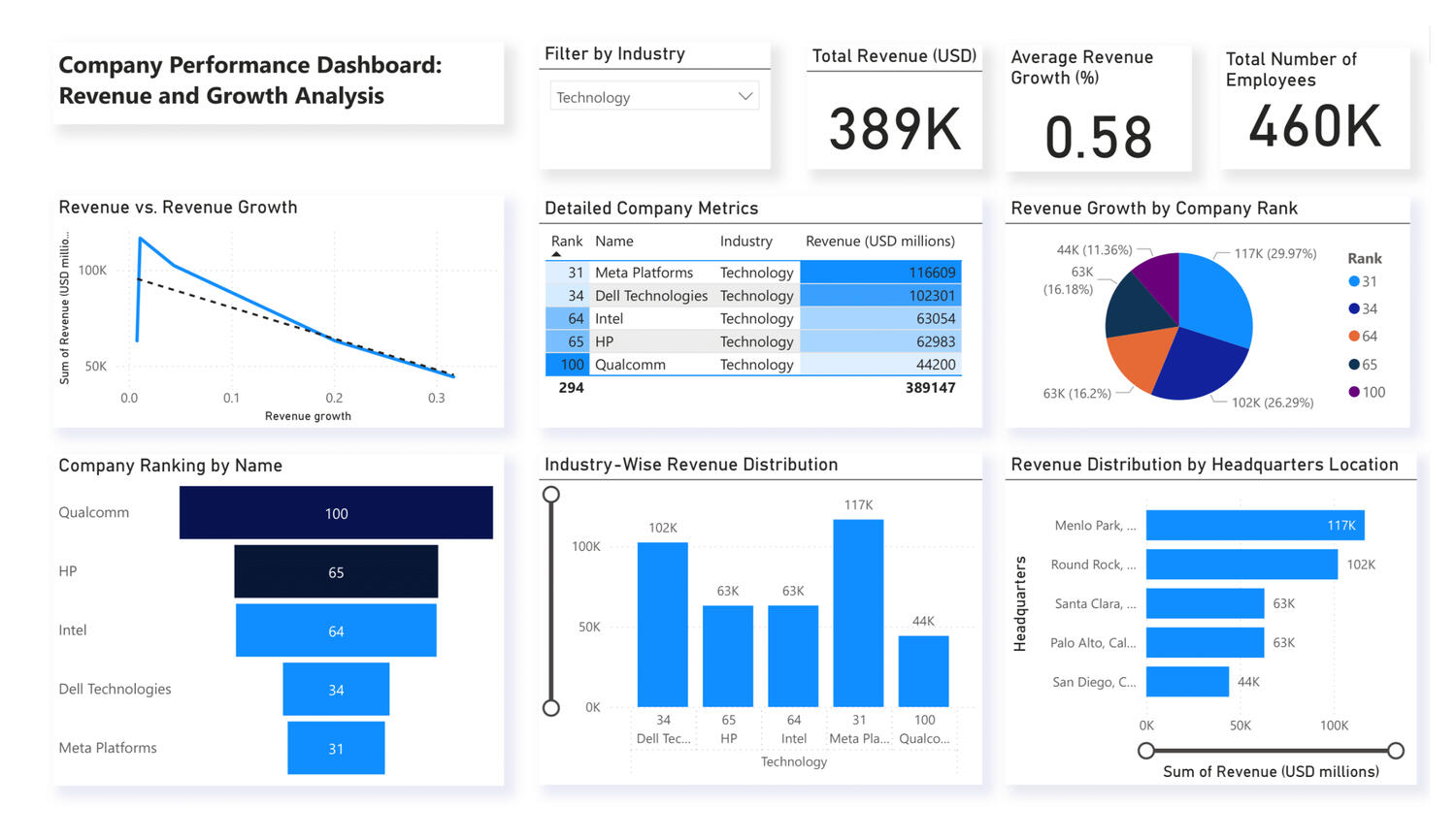
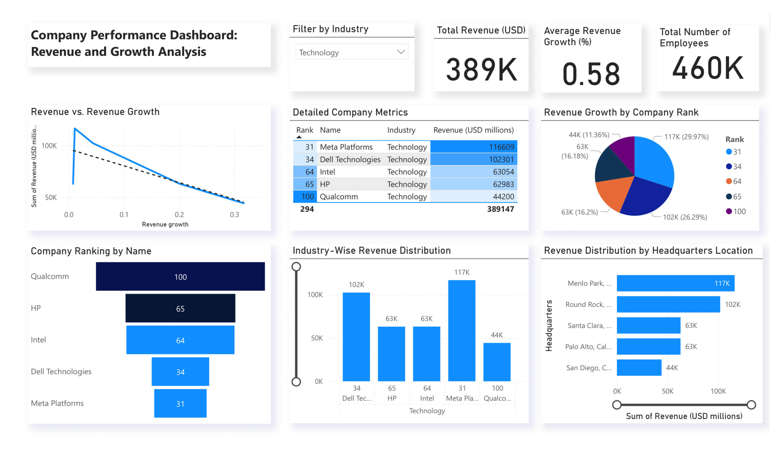
Revenue & Growth Dashboard
I developed a Power BI dashboard to analyse company revenue and growth performance across various industries, focusing on financial trends, market ranking, and business intelligence insights.Project Purpose & Rationale
The goal of this project was to:
- Identify top-performing companies based on revenue and growth.
- Analyse how industry and location impact revenue performance.
- Provide interactive insights using Power BI for better decision-making.Key Dashboard Features & Analysis
📊 Revenue Analysis – Tracked and compared total revenue across different companies, industries, and headquarters.
📈 Growth Trends – Examined revenue vs. revenue growth trends to identify high-growth companies.
🏆 Company Ranking – Ranked companies based on revenue to assess market leadership.
🎯 Interactive Industry Filter – Enabled dynamic filtering to explore industry-specific insights.
💡 Geographical Insights – Analysed revenue distribution by headquarters location to assess regional strengths.
📌 Key Metrics & KPIs – Showcased total revenue, revenue growth percentage, and employee count for quick insights.Key Questions Answered:
1) Which companies have the highest revenue and growth rates?
2) How does revenue vary by industry and headquarters location?
3) What is the relationship between revenue and revenue growth?
4)Which industries are dominated by high-revenue companies?Findings & Business Insights:
- Meta Platforms and Dell Technologies lead in total revenue, with over $100B+ in earnings.
- Revenue growth trends do not always correlate with total revenue—some lower-revenue companies have higher growth percentages.
- Menlo Park and Round Rock headquarters house the highest-revenue companies.
- The technology sector shows strong revenue performance but varied growth rates.Skills Demonstrated:
✔ Power BI Data Modelling & Visualization
✔ DAX Formulas for KPI Calculation
✔ Data Cleaning & Transformation in Power Query
✔ Business Intelligence & Financial AnalysisThis project strengthened my ability to transform raw business data into meaningful insights, making it a valuable addition to my portfolio. 🚀
SQL | Power BI
MPS Monthly Crime data
The Metropolitan Police Service (MPS) Monthly Crime Dataset contains crime records across different boroughs, categorised by offence type and time period. It provides insights into crime trends, law enforcement effectiveness, and geographical crime distribution.🎯Objectives
- Analyse crime trends over time and identify seasonal patterns.
- Compare crime rates across boroughs to detect high-risk areas.
- Categorise crime types to understand offence distribution.
- Ensure interactivity with filters for crime type, time, and boroughs.SQL Data Cleaning & Preparation
To ensure the dataset is accurate and structured for Power BI, the following SQL steps were performed:
1. Standardised Date Format

2. Removed Duplicates
Eliminated duplicate records to maintain data accuracy.

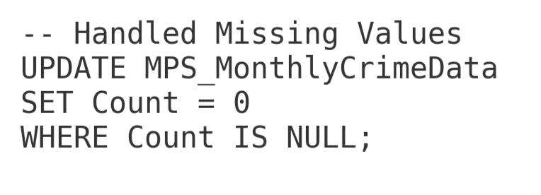
3. Handled Missing Values
Replaced missing Count values with 0 to avoid errors in calculations.
4. Filtered Data for Relevant Years
Kept only records from 2018 onwards to focus on recent trends.

5. Checked Final Data
Verified the cleaned dataset before analysis.

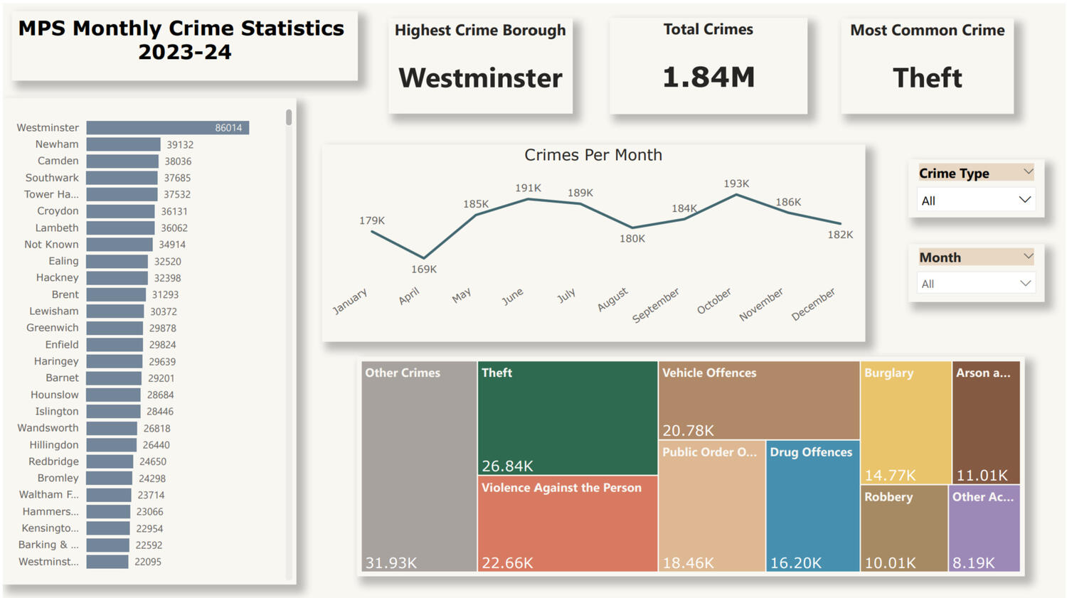
📊 Dashboard FeaturesBorough-wise Crime Distribution
- Visual: Bar Chart
- Insight: Westminster has the highest crime rate (86K crimes).Monthly Crime Trends
- Visual: Line Chart
- Insight: Crime rates fluctuate, peaking in May, July, and October.Crime Type Breakdown
- Visual: Treemap
- Insight: Theft is the most common offence, followed by violent crimes.
- Enhancement: Grouped minor crimes into "Other Crimes" for better readability.Key Metrics:
- Total Crimes: 1.84M
- Highest Crime Borough: Westminster
- Most Common Crime: Theft
Interactive Filters
- Crime Type Selector – Enables focus on specific crimes.
- Month Selector – Shows crime fluctuations over time.
🔧 Data Preparation in Power BIData Cleaning:
- Removed duplicates and irrelevant records.
- Standardised date formats and filtered relevant years.
- Grouped minor crime types into "Other Crimes" for clarity.Data Modelling:
- Created DAX measures for Total Crimes, Most Common Crime, and Borough with Highest Crime.
- Applied Power Query transformations for crime categorisation.Dashboard Formatting:
- Applied a professional colour scheme matching neutral and accent tones.
- Adjusted transparency for cleaner visual aesthetics.
- Enhanced label visibility in Treemap and Bar Charts.
🚀 Final Impact
✅ Interactive & Insightful – Users can filter crime trends dynamically.
✅ Clean & Professional – Well-structured design with clear visuals.
✅ Optimised for Readability – Improved labels, colours, and text alignment.
🔹 Tools Used: SQL, Power BI, DAX, Power Query
🔹 Skills Demonstrated: Data Cleaning, Visualisation, DAX, Dashboard Design
Tableau
Knife crime in england and wales
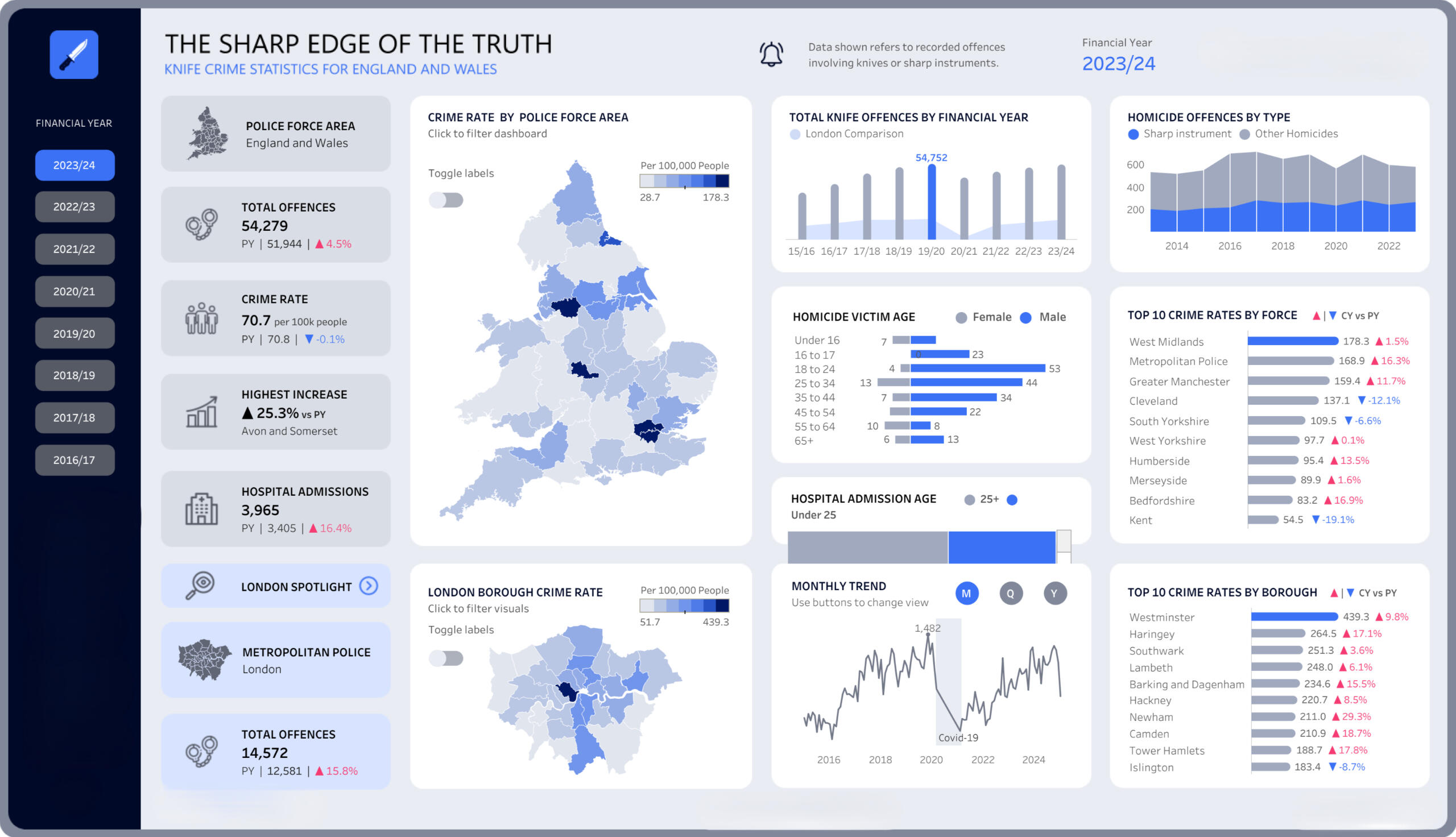
This Tableau dashboard provides an in-depth analysis of knife crime statistics across England and Wales for the financial year 2023/24. The data covers multiple dimensions, including crime rates by police force area, total offences, hospital admissions, homicide demographics, and trends over time. This report outlines the data processing steps, methodology, and insights derived from the analysis.Data Collection and Cleaning
The dataset was sourced from publicly available crime reports and raw CSV files detailing knife-related offences across various jurisdictions. To ensure accuracy and consistency, the dataset was cleaned and prepared in Microsoft Excel before being imported into Tableau. The following steps were undertaken:1. Data Cleaning:
- Removed duplicate records and missing values.
- Standardised date formats to align with financial years.
- Reformatted police force names to ensure consistency.2. Data Transformation:
- Added calculated fields to measure percentage changes from the previous year.
- Merged multiple datasets to include hospital admissions and homicide statistics.
- Created new fields such as ‘Crime Rate per 100,000 People’ for comparative analysis.3. Data Upload to Tableau:
- After data cleaning, the refined dataset was uploaded into Tableau.
- Relationships were defined between datasets to enable interactive filtering.
- Calculated fields were created within Tableau to enhance real-time visualisation capabilities.Dashboard Features
The Tableau dashboard presents key statistics with interactive visuals, allowing users to explore trends and patterns effectively.
- Crime Rate by Police Force Area: A heatmap visualisation highlights areas with the highest and lowest crime rates.
- Total Offences by Financial Year: A bar chart compares year-on-year knife crime trends, showing peak crime periods.
- Homicide Offences by Type: A line chart contrasts sharp instrument-related homicides with other homicide types.
- Homicide Victim Demographics: A breakdown of homicide victims by age and gender, helping identify vulnerable groups.
- Top 10 Crime Rates by Borough: A ranked bar chart displays the boroughs with the highest crime rates.
- Monthly Trends: A time series chart outlines crime fluctuations, indicating seasonality and potential external influences.Key Insights
- Crime Concentration: Metropolitan areas such as London and West Midlands report the highest crime rates.
- Rising Offences: There is a 4.5% increase in total offences compared to the previous year, with significant rises in certain boroughs.
- Hospital Admissions: A 16.4% rise in hospital admissions suggests an increase in knife-related injuries.
- Demographics: Males aged 18 to 34 are the most affected by knife-related homicides.Conclusion
This Tableau dashboard provides an interactive way to analyse knife crime statistics, aiding policymakers, law enforcement, and researchers in making data-driven decisions. The dataset was meticulously cleaned and processed in Excel before being integrated into Tableau for visual storytelling and dynamic insights.
Excel | Power bi
Netflix engagement analysis dashboard🎬
📌 Overview
This project showcases my ability to work with Excel Data Models, Power Pivot, DAX, and Power BI to analyse Netflix customer engagement and churn. The dataset includes customer demographics, subscription details, and engagement metrics, allowing for in-depth insights into churn rates, average watch time, and content preferences.
The analysis follows a structured approach:
✅Data Cleaning & Transformation in Excel
✅ Building a Relational Data Model in Power Pivot
✅ Creating DAX Measures for Advanced Calculations
✅ Developing a Professional Power BI Dashboard
📊 Step 1: Data Preparation in ExcelData Cleaning & Structuring
Before loading into Power BI, the raw dataset was cleaned and structured in Excel:
- 🧹 Removed duplicate records and handled missing values
- 📅 Standardised date formats for consistency
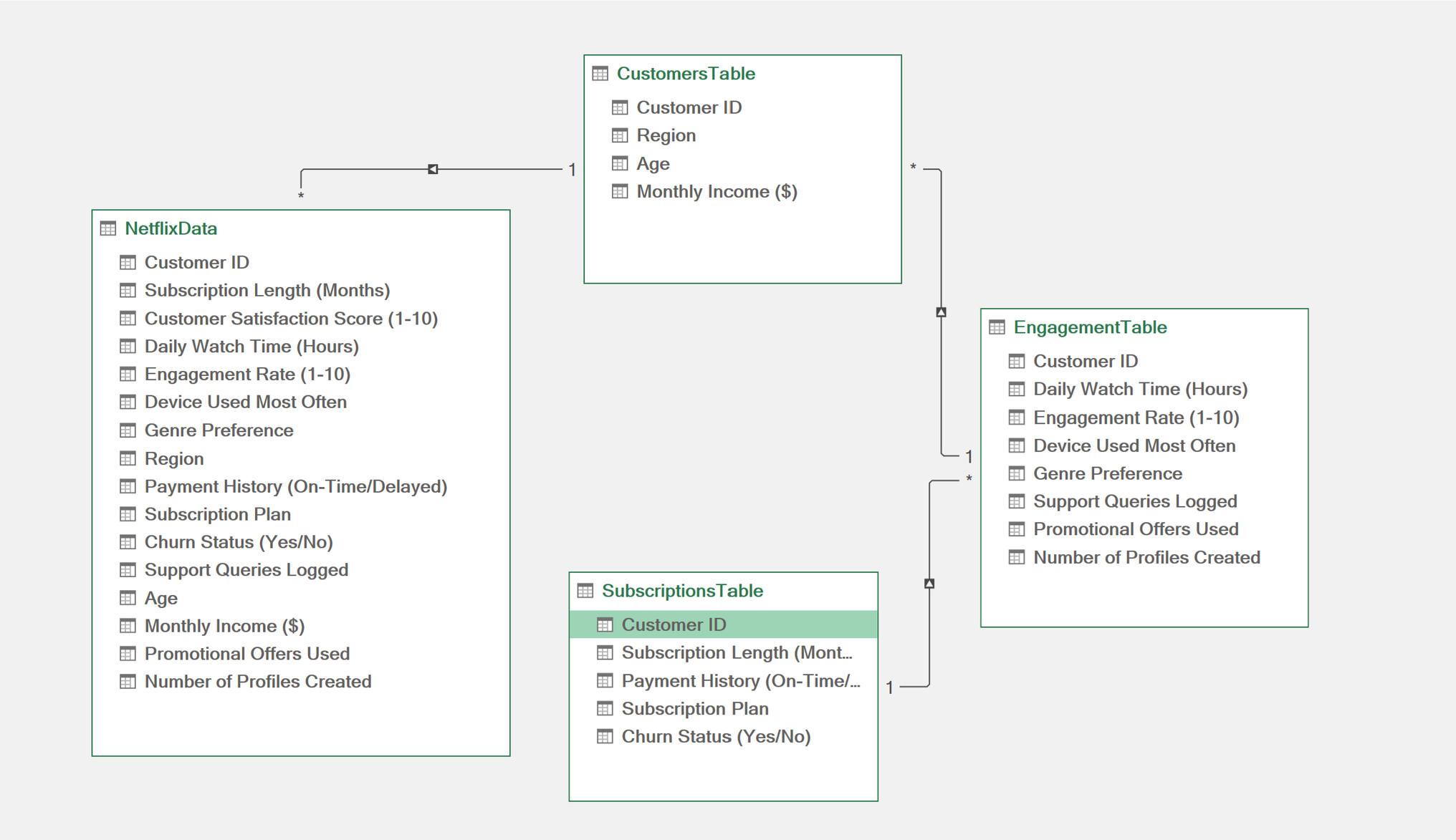
- 📊 Organised data into three logical tables:
1️) CustomersTable – Contains Customer ID, Age, Region, and Income
2️) SubscriptionsTable – Includes Subscription Plan, Payment History, and Churn Status
3️) EngagementTable – Tracks Watch Time, Device Usage, and Genre PreferencesBuilding the Excel Data Model
- Each table was formatted as a structured table and added to Power Pivot.
- Relationships were established in Diagram View using Customer ID as the key.
- This transformed the dataset into a relational database, making analysis much more efficient.
Step 2: Implementing DAX in Power BI
To perform calculations and derive insights, I created DAX measures in Power BI, including:

📊 Step 3: Power BI Dashboard DevelopmentKey Visuals in the Dashboard
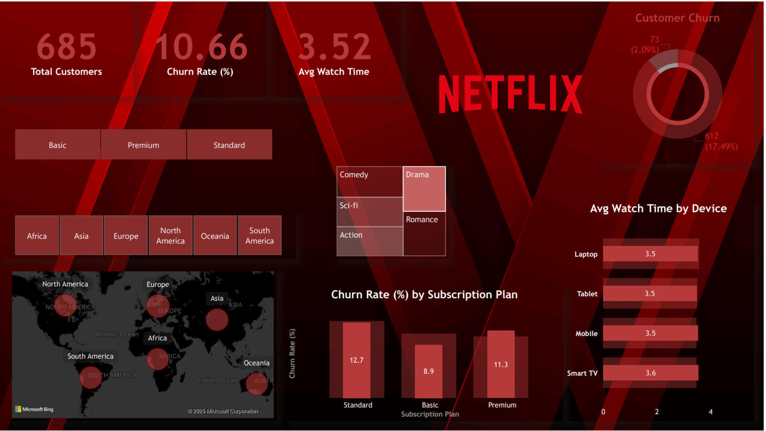
I designed an interactive Power BI dashboard with a Netflix-themed dark UI that includes:
📌 KPI Cards – Showcasing Total Customers, Churn Rate, and Average Watch Time
📌 Churn Rate by Subscription Plan – Identifies churn behaviour across plans
📌 Customer Distribution by Region – A map highlighting Netflix’s global reach
📌 Device Usage for Engagement – Shows preferred viewing devices
📌 Churn Breakdown – A Donut Chart visualising churn percentages
📌 Genre Preferences – A Treemap displaying content preferences among customersEnhancements
- Applied a custom Netflix-themed background to create a cinematic feel
- Used slicers to enable filtering by subscription plan and region
- Improved layout structure to balance KPIs, charts, and interactivityKey Insights from the Analysis:📉 Churn Behaviour:
1) The Standard Plan had the highest churn rate (12.9%), followed by Basic (10.8%) and Premium (10.3%).
2) Customers on the Premium Plan had higher engagement despite a slightly lower churn rate.🌍 Regional Distribution:
1) North America & Europe had the highest Netflix customer base.
2) Oceania & South America showed lower engagement rates.📱 Device Engagement Trends:
1) Laptop & Tablet users had slightly higher average watch times.
2) Smart TVs & Mobile had similar watch time metrics, showing consistency in engagement.**🎬 Genre Preferences: **
1) Drama, Comedy, and Thriller were the most preferred genres.
2) Documentaries & Sci-Fi had lower engagement rates, indicating niche audiences.This project demonstrates my ability to:
✅ Clean and structure data in Excel for better organisation.
✅ Build a relational Data Model in Power Pivot to establish efficient connections.
✅ Apply DAX measures in Power BI to derive meaningful insights.
✅ Design an interactive and visually appealing Power BI dashboard.
By leveraging Excel, Power Pivot, and Power BI, I successfully transformed raw Netflix engagement data into a business-ready analytical report. The insights derived from this dashboard can help optimise retention strategies, improve customer engagement, and refine content offerings.


